Summer Olympics Dashboard
Overview
Drawing on Tableau's Iron Viz format, Deloitte Viz Games is a global data visualization competition, where participants create a data visualization based on a theme. A judging panel of topic specialists and data gurus evaluate the entries on design, storytelling, and analysis.
In 2024, the theme was the Olympics. Our team wanted to tell an underdog story by analyzing gold medal rankings alongside a country's GDP and population. I led the design and copywriting, collaboratively closely with the data scientist and Tableau developer to ensure data accuracy and technical feasibility.
Out of 38 countries, 419 teams and 603 participants, our dashboard earned us a spot as a finalist and (unofficially) second place by the judges.
Client
International Olympic Committee (IOC)
Role
Product Designer
Team
Tableau Developer
Data Scientist
Timeline
February – March 2024 (4 weeks)
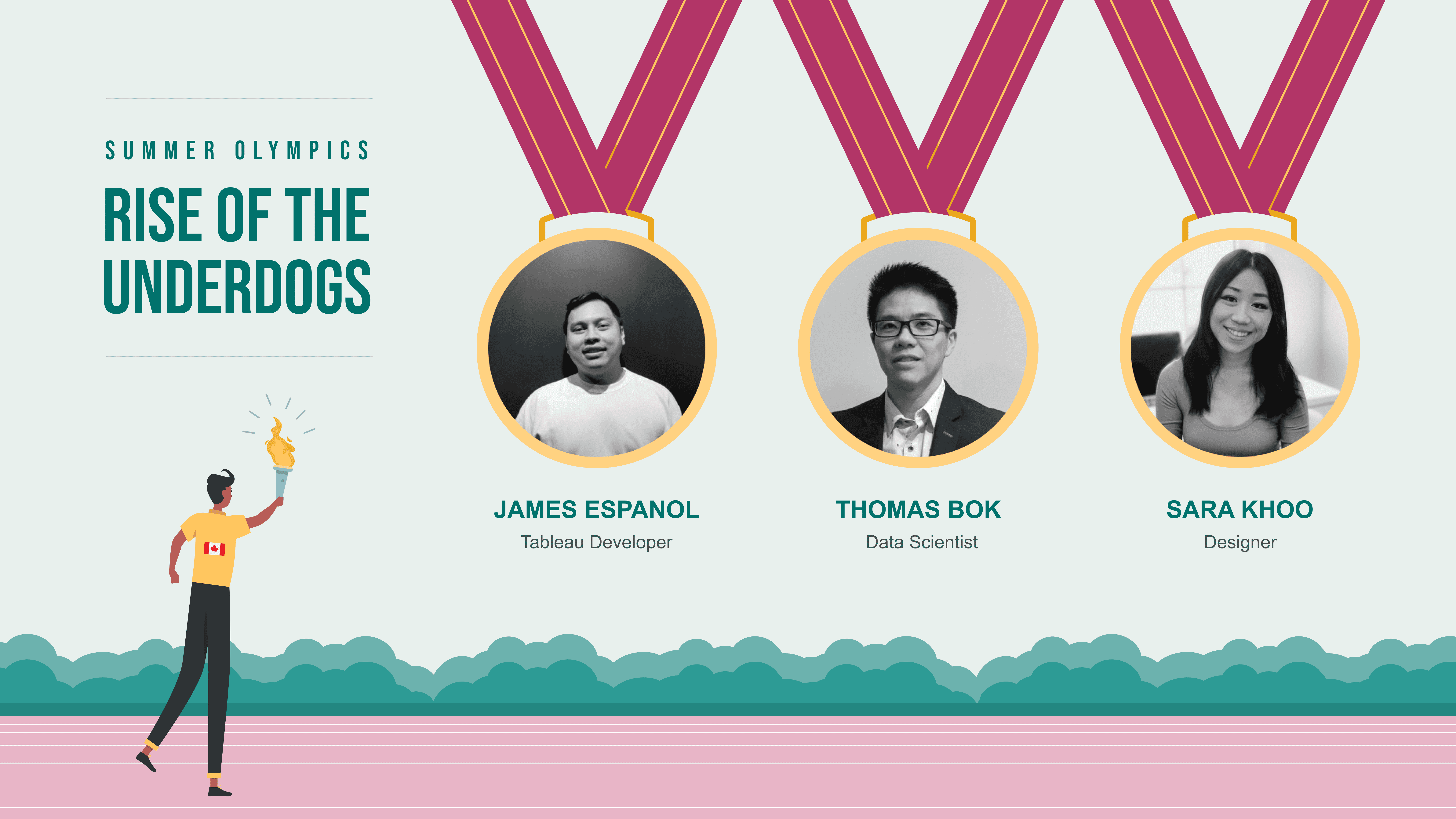
Our Deloitte Viz Games 2024 team.
Image
Context
An opportunity to be a data storyteller.
Win or learn — you can't lose.
Every year, Deloitte hosts what we call 'Deloitte Viz Games' — a spin off of Tableau's Iron Viz Games. This is a competition where Deloitte employees globally compete to tell a compelling story with data within 4 weeks.
Below is our process within the project timeline.

Project timeline.
Image
Judging Criteria
How will the submissions be scored?
The judges will review submissions and score them according to the following criteria:
Design
How appropriate is the design for the story that is being told?
Storytelling
Is there a clear story being told or question being explored?
Analysis
How sophisticated and appropriate is the data that is being used for the story?
Design Process
Crafting the narrative.
Brainstorming themes.
Brainstorming took up the biggest chunk of our project time. We bounced around a lot of ideas before finally landing on our theme.
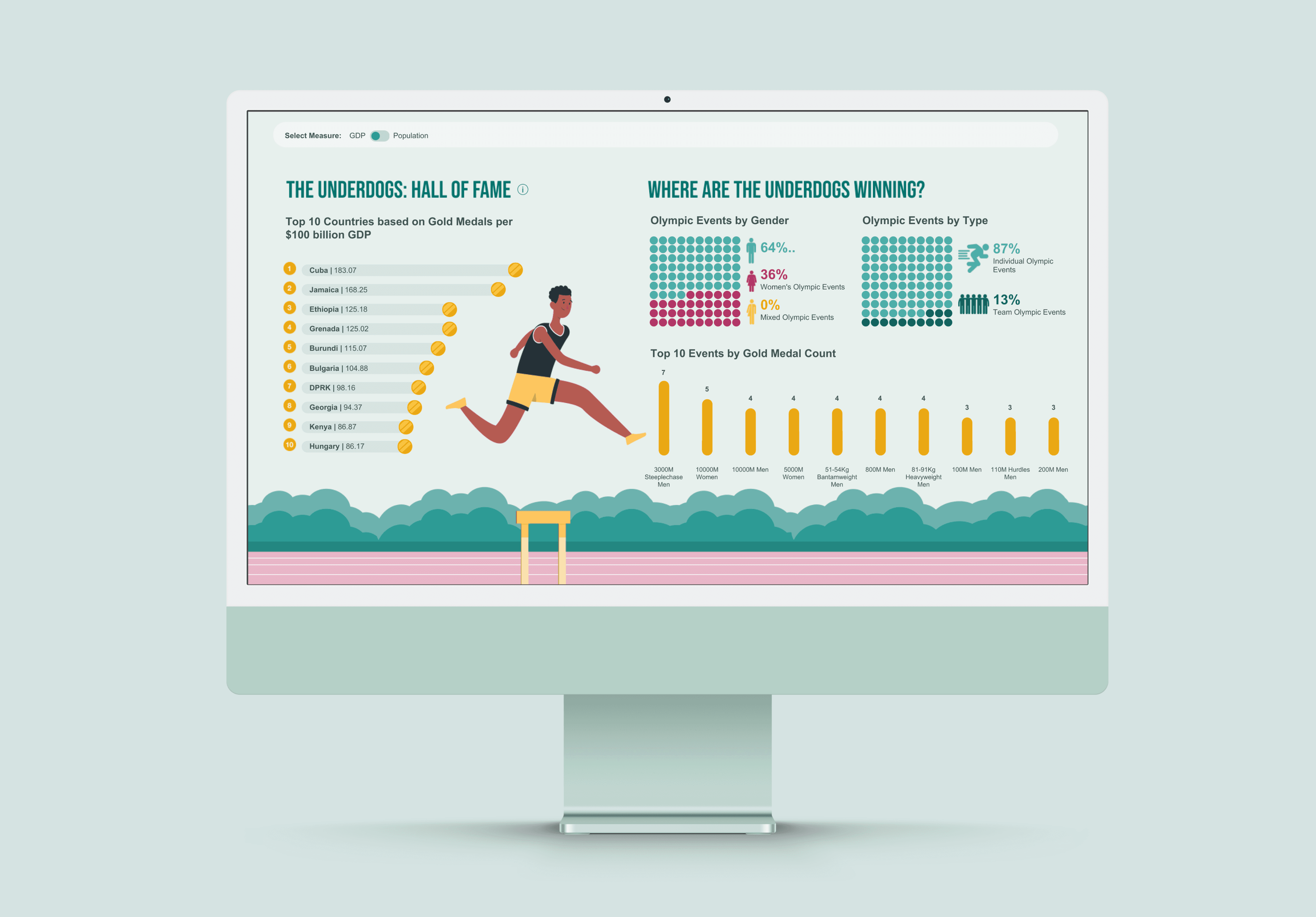
Our research led us to ask: Who really wins Olympic games?
By analyzing GDP and total medal counts from the last five Summer Olympics, we discovered a clear trend: countries with higher GDPs tend to win more medals. But GDP alone doesn't tell the whole story. When we ranked countries by medals won relative to GDP, it revealed the underdog victories and unexpected overachievers.
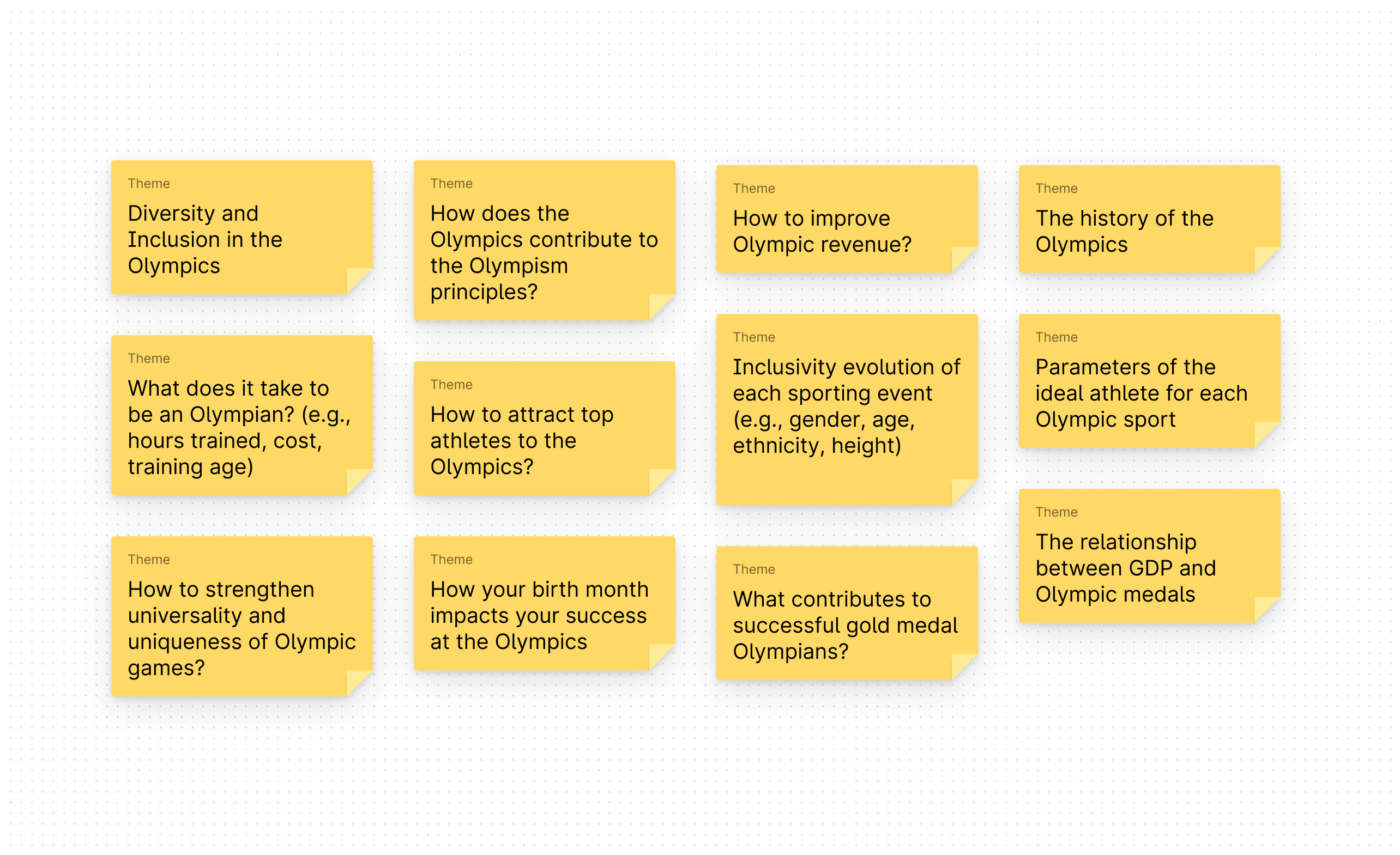
Theme ideas.
Image
Mapping the data journey.
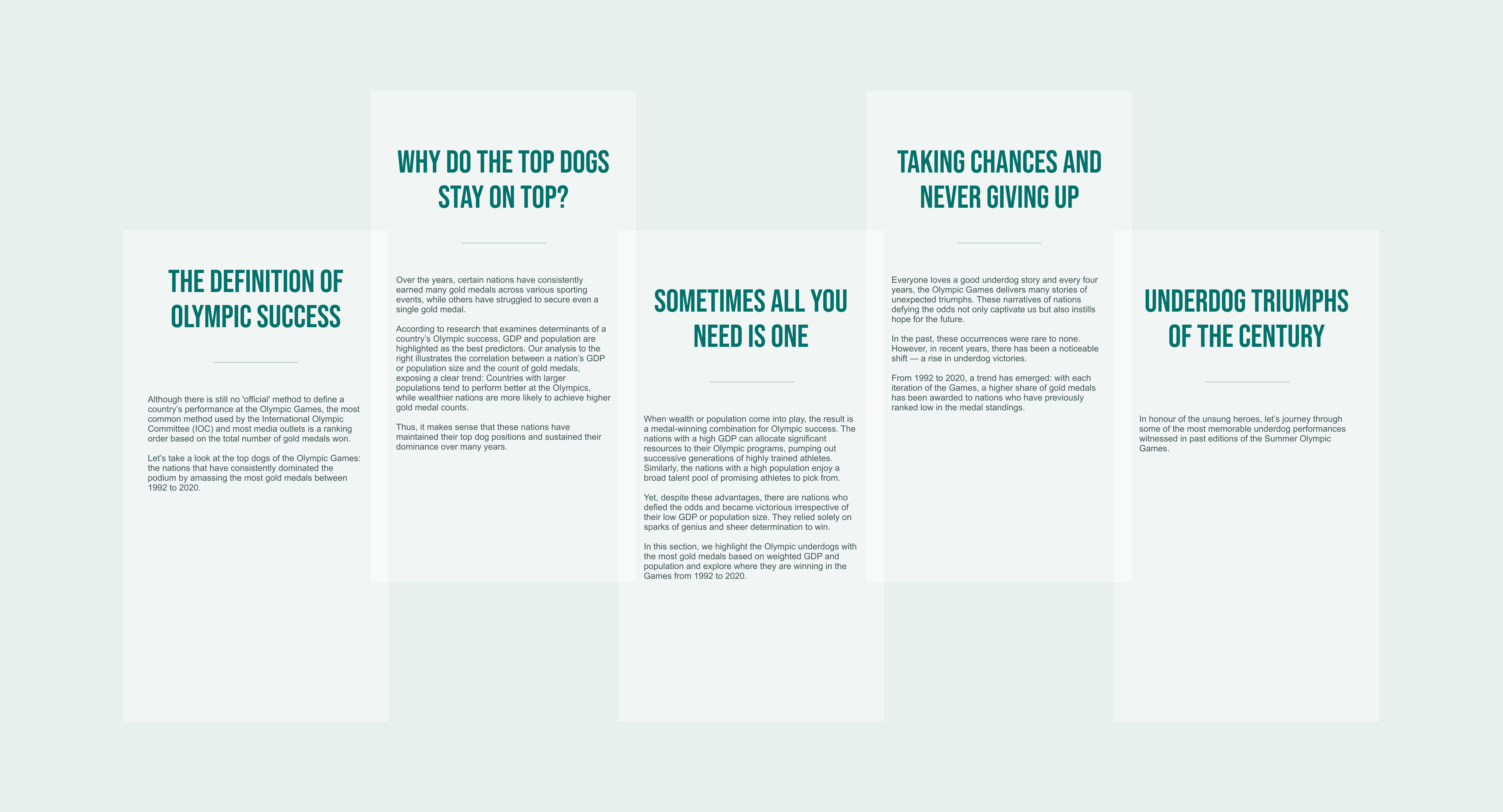
After compiling the data from our research, I started crafting the overall flow and story we wanted to tell.
We set out to highlight the Olympic underdogs — those countries that defy the odds and win gold medals despite the statistics. While higher GDP often means more resources and more medals, we wanted to share an inspiring message: victory is within reach for everyone, no matter the odds.
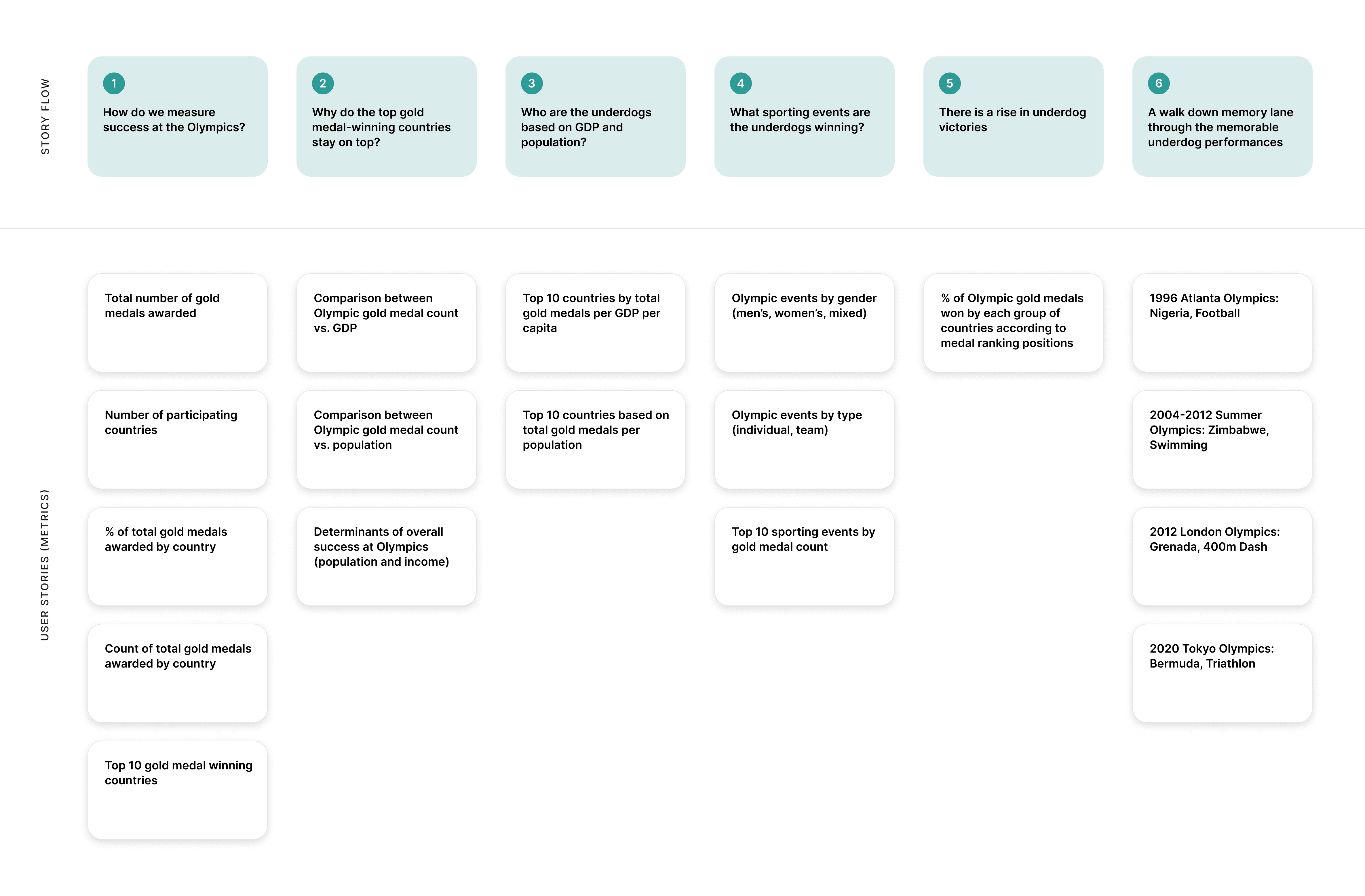
Story mapping exercise.
Image
Writing the story.
Once we nailed down the narrative flow, I wrote the copy for each section of the dashboard, adding story-driven context to bring the visualizations to life.
Narrative text.
Image
Style Guide
Colouring outside the lines.
A moodboard inspired by the movies.
There's so much thought that goes into choosing the right colour palette.
At first, I struggled to settle on a colour scheme for the dashboard. I found inspiration in Wes Anderson's films, where his playful use of colour and whimsical style add depth to his stories. Drawing from his vibrant palettes helped me bring a playful feel to the design.

Wes Anderson moodboard.
Image
A style guide with a colourful personality.
We chose Arial for the body font to ensure legibility and compatibility across all devices while maintaining the boldness of Bebas Neue.
While many competitors would likely stick to the Olympic branding, we opted for a unique colour scheme to set ourselves apart.
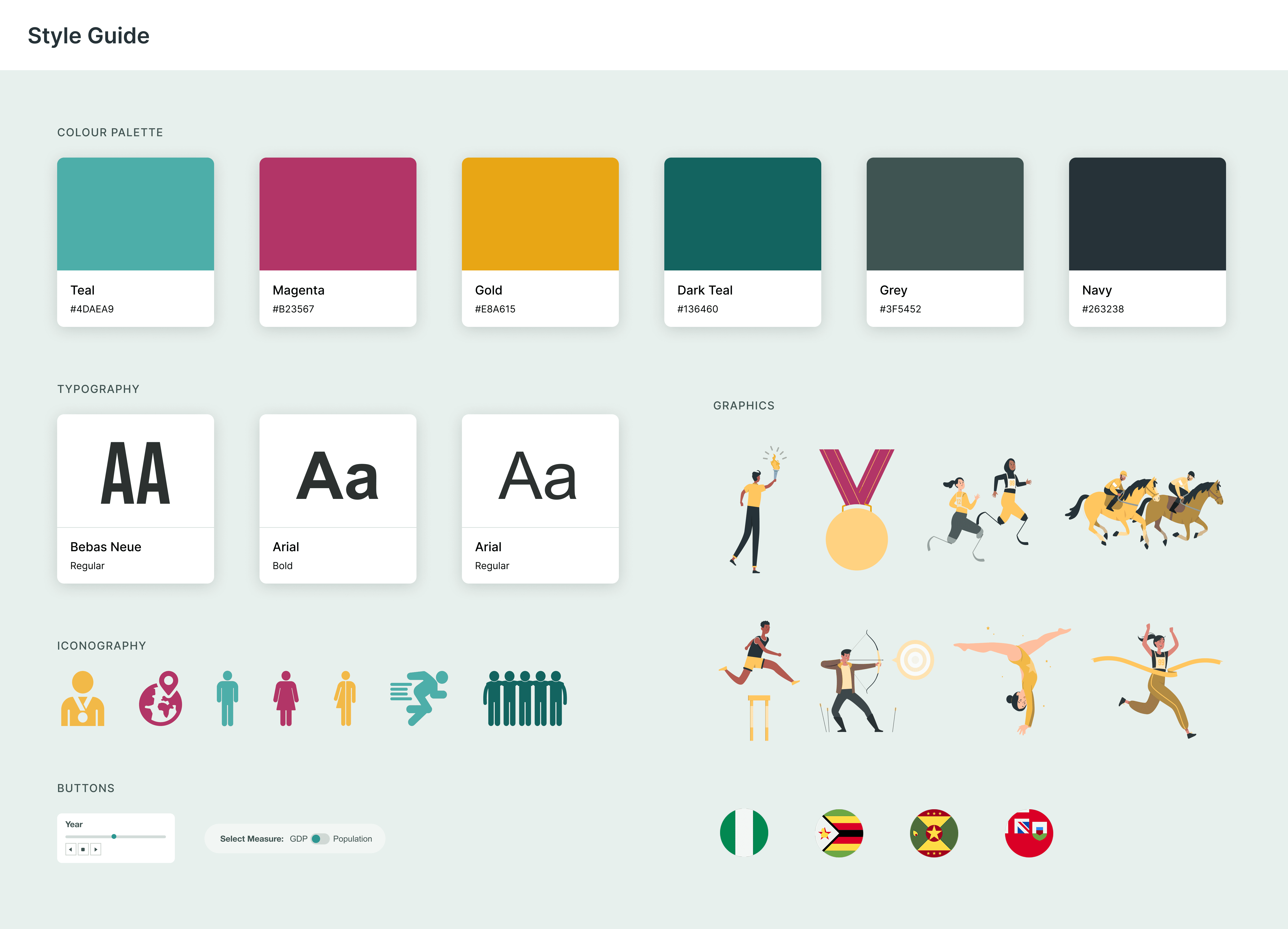
Style guide.
Image
Interactions
The magic is in the details.
Finishing touches.
To keep the design clean while still providing users with the essential context and data, we added tooltips that also allowed for a fun and interactive user experience.
One of my favourite interactions was hovering over the flags to reveal an image of the athlete at their respective Olympic event — it really brought our story to life.
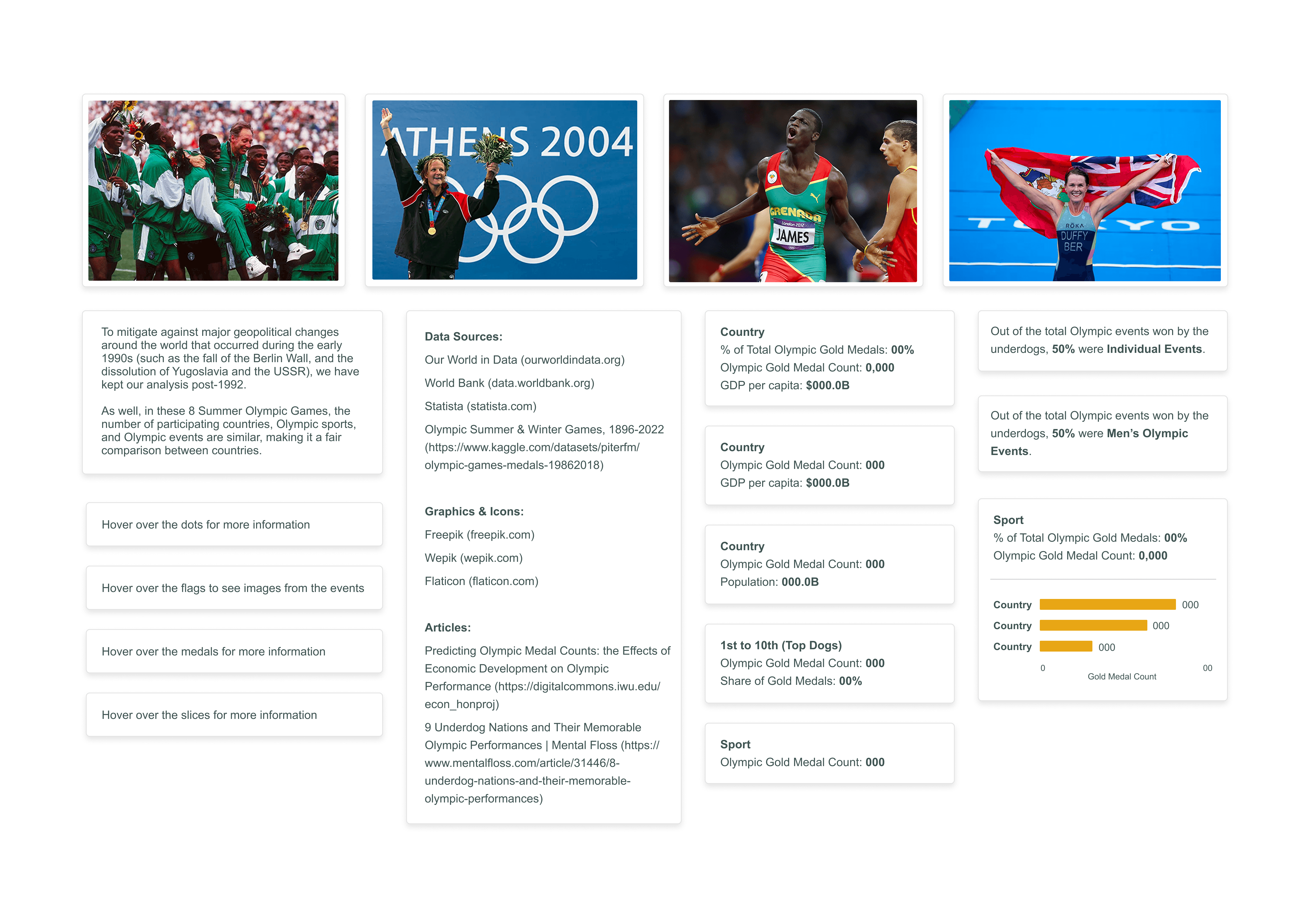
Tooltips.
Image
Final Design
Telling the story of the underdogs.
A horizontal scroll data adventure.
From start to finish, I wanted the design to capture the energy of a track and field event — a feeling that really connects with Olympic viewers. The Olympic torch at the beginning sets the stage, representing the excitement of the opening ceremony.
I also wanted to celebrate the diversity of the Games, highlighting a range of Olympic sports, including paralympic sports, to show how the Olympics bring together people of all abilities and talents.
And, of course, I had fun integrating design elements into the visualizations to make the data feel more engaging, dynamic and meaningful — such as the gold medal pie chart and the gymnast balancing on the beam.
Tableau functionality walkthrough.
Video
The Grand Finale
The battle for Deloitte Viz Games champion.
Once the designs were submitted, they were evaluated and scored by a panel of first-round judges based on the judging criteria. The top four teams will advance to the Grand Finale for a shot at becoming the 2024 Deloitte Viz Games Champion!
Our team was happy to make it to the finals as 1 of 4 finalists. Below are the finalist presentations, where we had to craft a script and present our story to an audience of over 200 attendees.
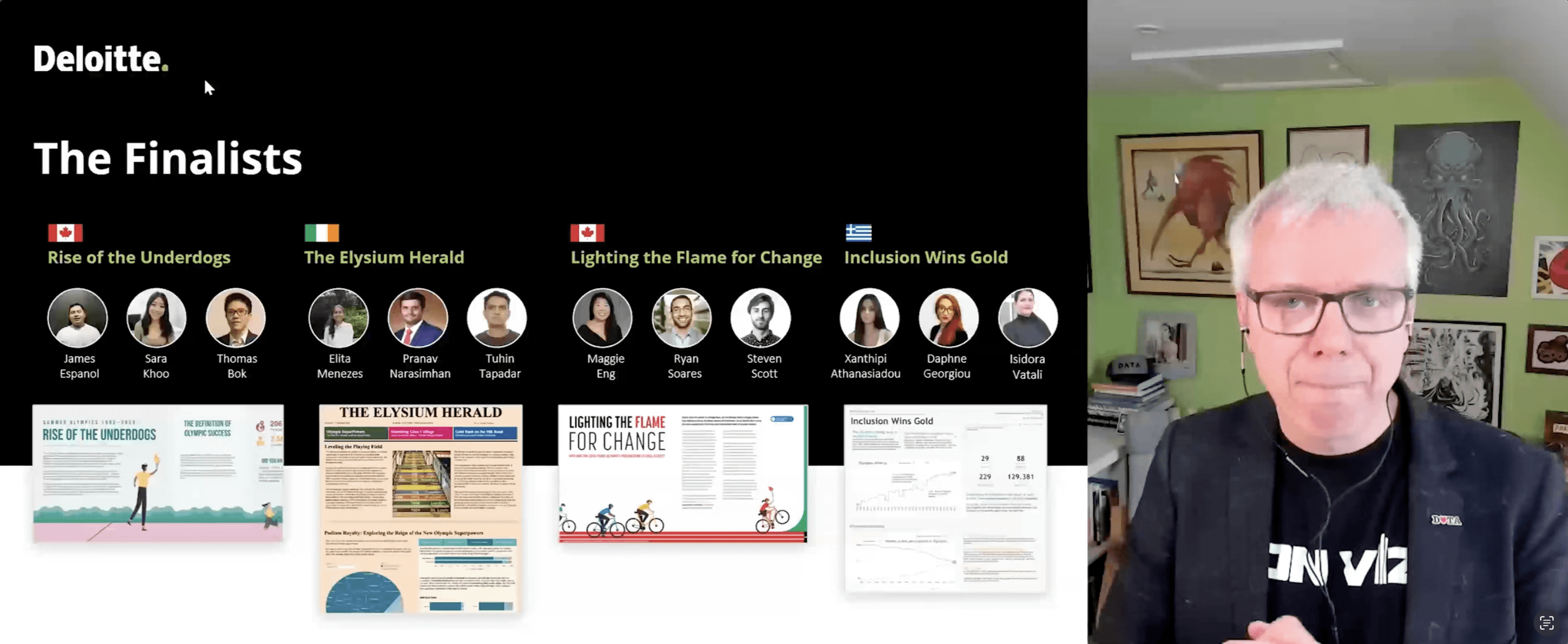
A still from the Grand Finale presentations.
Image
Results
The Grand Finale.
Although we didn't take home the Deloitte Viz Games 2024 Champion title, making it to the finals among so many talented teams was an incredible achievement. The judges even unofficially told us we placed second. The cherry on top was having the International Olympic Committee (IOC) see our visualization — a truly incredible opportunity!
38
Countries
419
Teams
603
Participants
Results
Our dashboard made it as 1 of 4 finalists and got (unofficial) Second Place by the judges!
Retrospective
We are all winners in the end.
Diamonds are made under pressure.
Balancing this project with my daily work at Deloitte was challenging and stressful, but those intense moments sparked some of my best ideas.
Less is more.
My team and I got stuck in the details, trying to tell a complex story, but the most powerful stories are often the simplest. The winning story was simple yet powerful.
The real win was growth.
Even though we didn't win, making it to the finals felt like a victory! I got to really stretch my creativity with colours and find new ways to integrate Tableau visuals into the design.
Passion projects are my fuel.
Work often comes with constraints, but it's these personal projects that allow me to stretch my creativity and imagination.